
The Secret Language of Blooms: How Flower Colors Shape Your Event’s Vibe
Have you ever walked into a wedding and instantly felt a wave of serene calm? Or stepped into a corporate gala that buzzed with sophisticated energy? That immediate, gut feeling isn’t accidental. Often, it’s orchestrated by a silent, powerful force in the room: the color of the flowers.
Forget thinking of floral decor as just a pretty accessory. It’s one of the most potent tools for storytelling and emotional engineering at any event. While the type of flower and its arrangement matter, color is the most immediate psychological messenger.
This isn’t just artistic intuition; it’s science. Our brains are hardwired to respond to color. It influences our mood, our appetite, and even our conversations. So, whether you’re planning a wedding, a corporate launch, or an intimate birthday party, understanding the psychology of flower colors is your secret weapon to creating an unforgettable experience.
Let’s decode the secret language of blooms.
Why Color Psychology is Your Event’s Best Kept Secret
Before we dive into the rainbow, let’s talk about why this works. Our reaction to color is primal and deeply ingrained.
-
It’s Biological: When light hits our eyes, it doesn’t just go to the visual cortex to process an image. It also travels to the hypothalamus, a part of the brain that governs our hormones and emotions. The vibrant, energy-packed hue of a red rose can literally quicken your pulse, while the soothing tones of blue hydrangeas can promote a sense of calm.
-
It’s Cultural: We’ve also learned what colors mean. In Western cultures, white signifies purity and is classic for weddings. In many Eastern cultures, white is worn at funerals. For an event with a diverse guest list, being mindful of these associations is key to sending the right message.
By choosing your floral palette with intention, you move beyond decoration and into the realm of experience design. You’re not just filling vases; you’re conducting the emotional atmosphere of your event.
A Deep Dive into the Emotional Spectrum of Flowers
Ready to become fluent in the language of color? Here’s your guide to what each hue communicates.
🔴 Red: The Bold Energizer
-
The Vibe: Passion, excitement, high energy, and love. It’s also a known appetite stimulant!
-
Perfect For: Dramatic galas, product launches (especially for food, cars, or tech), festive holiday parties, and as a powerful accent at romantic weddings.
-
Bloom Picks: Red Roses (the ultimate classic), Tulips, Poppies, Gerbera Daisies, Anthurium.
-
Pro Tip: A little red goes a long way. Use it in focal points like centerpieces or entrance arrangements to create dynamic energy without overwhelming the space. Pair with black or charcoal for a sleek, modern look.
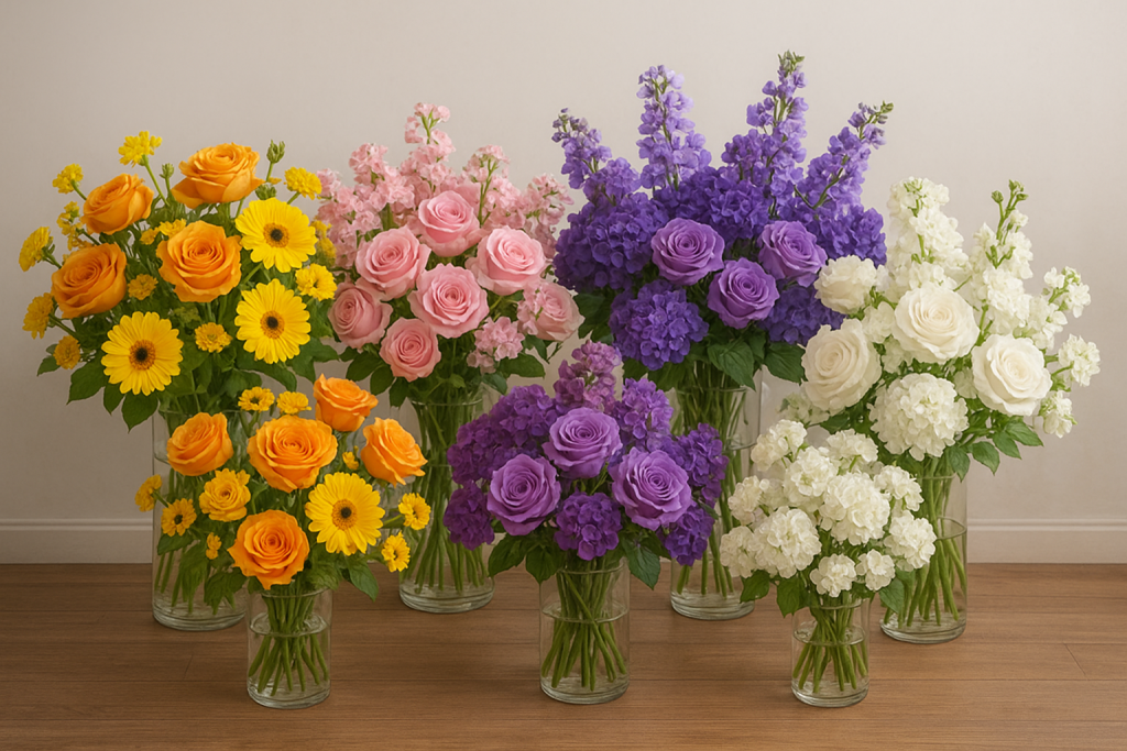
💗 Pink: The Charming Nurturer
-
The Vibe: Compassion, sweetness, playfulness, and romance. Pink is a calming color that feels nurturing and warm.
-
Perfect For: Weddings, baby showers, charity events, and birthday parties. It creates an instantly welcoming atmosphere.
-
Bloom Picks: Peonies (luxurious romance), Garden Roses, Ranunculus, Blush Hydrangeas, Sweet Peas.
-
Pro Tip: The shade changes everything. Soft blush pinks are romantic and elegant, while hot pink is confident and fun. Mixing shades adds beautiful depth.
🟠 Orange: The Friendly Socializer
-
The Vibe: Enthusiasm, creativity, warmth, and fun. It’s the social butterfly of colors—friendly, approachable, and joyful.
-
Perfect For: Autumn weddings, Halloween parties, creative industry mixers, and summer soirées. It’s fantastic for encouraging conversation.
-
Bloom Picks: Marigolds, Ranunculus, Tulips, Lilies, Zinnias.
-
Pro Tip: Orange is inherently casual and exuberant. Use it in abundant, loose arrangements to amplify its cheerful vibe. It looks stunning paired with its color wheel opposite, blue.
💛 Yellow: The Radiant Optimist
-
The Vibe: Happiness, optimism, intellect, and warmth. It’s like a shot of sunshine, proven to boost mood and mental activity.
-
Perfect For: Morning brunches, spring weddings, educational conferences, and any event where you want to spark joy and creativity.
-
Bloom Picks: Sunflowers (pure joy), Daffodils, Dahlias, Yellow Roses, Billy Balls.
-
Pro Tip: Pale yellows are soft and cheerful, while bright yellows are energetic and attention-grabbing. Use it to brighten dim corners or as a happy accent. Too much bright yellow can be overwhelming, so balance is key.
💚 Green: The Harmonizing Balancer
-
The Vibe: Balance, harmony, renewal, and health. As the most abundant color in nature, it’s inherently restful and calming for the human eye.
-
Perfect For: Eco-friendly brand launches, corporate events (signifying growth and stability), wellness retreats, and as the essential supporting player in every arrangement.
-
Bloom Picks: It’s all about the foliage! Eucalyptus, Ferns, Ruscus, Bells of Ireland, Green Hydrangeas.
-
Pro Tip: Green is the workhorse of florals. It provides breathing room between colors and adds texture. A monochromatic green palette is incredibly sophisticated and serene, evoking a secret garden feel.
🔵 Blue: The Tranquil Calm
-
The Vibe: Calmness, serenity, trust, and intelligence. It has a proven relaxing effect on the mind and body.
-
Perfect For: Corporate events where trust is key (finance, tech, healthcare), waterfront or winter weddings, and spa-like wellness events.
-
Bloom Picks: True blue is rare! Look for Delphinium, Hyacinth, Cornflower, Nigella, and Iris. Designers sometimes use tinted flowers (like blue orchids) to achieve the perfect hue.
-
Pro Tip: Light blues are airy and peaceful. Deep navies feel authoritative and confident. Since blue can feel cool, warm it up with metallics like gold or copper, or pair with creams and greens.
💜 Purple: The Regal Creative
-
The Vibe: Luxury, wisdom, creativity, and mystery. It strikes a perfect balance between the stability of blue and the energy of red.
-
Perfect For: Luxury galas, fundraisers, spiritual ceremonies, and weddings that aim for a royal, elegant aesthetic.
-
Bloom Picks: Lavender (for calm and scent), Orchids (exotic luxury), Lilacs, Allium, Anemones.
-
Pro Tip: Lavender and lilac are soft and romantic. Eggplant and plum are rich, dramatic, and opulent. Use deep purples in lavish arrangements to maximize a sense of luxury and extravagance.
⚪ White: The Pure Modernist
-
The Vibe: Purity, innocence, simplicity, and peace. It reflects light, making spaces feel larger, brighter, and clean.
-
Perfect For: Weddings, memorials, minimalist-themed events, and high-end product launches (think tech).
-
Bloom Picks: Calla Lilies (modern elegance), Gardenias, Stephanotis, White Roses, Peonies, Anemones.
-
Pro Tip: An all-white palette is timeless and elegant. To avoid a sterile feel, focus on texture—mix flowers with different petal structures and include plenty of lush green foliage for depth.
Putting It All Together: Color Palettes for Real Events
Theory is great, but how does it work in practice? Here’s how to apply this knowledge.
For the Romantic Wedding: Think blush pink, cream, and sage green. This analogous palette is soft, nurturing, and timelessly elegant.
For the High-Energy Product Launch: Use the brand’s colors as a base. Add silver and white for a techy, innovative feel, or orange accents to create excitement and buzz.
For the Sophisticated Corporate Dinner: A palette of navy blue, white, and touches of gold conveys trust, clarity, and premium quality. It’s powerful and polished.
For the Cozy Autumn Gathering: Embrace the season with terracotta, burnt orange, and mustard yellow. These warm, analogous colors feel friendly, creative, and deeply inviting.
For the Modern Gender-Neutral Baby Shower: Move beyond pink and blue. A palette of sage green, creamy white, and soft lemon yellow is fresh, joyful, and inclusive.
Remember the Supporting Cast
Your flower colors don’t work alone. Their impact is shaped by their environment:
-
Lighting: Warm candlelight will make reds and golds feel cozy and intimate. Cool, blue-toned uplighting can make white flowers feel sleek and modern.
-
Seasonality: Pulling colors from the season outside your window feels authentic and harmonious. Autumn’s rich reds and oranges naturally evoke warmth, while spring’s pastels speak of renewal.
-
Texture: A spiky, architectural protea feels bold and modern, while a soft, ruffled peony feels romantic and classic—even if they’re the exact same color.
Become the Conductor of Your Event’s Emotion
Choosing your flowers is one of the most impactful decisions you’ll make for your event. It’s a chance to go beyond aesthetics and touch the hearts of your guests on a subconscious level.
So, the next time you’re planning an event, don’t just ask, “What’s your favorite flower?” Instead, ask: “How do you want your guests to feel?”